![]()

News
Tutorials
183. Blend mode details
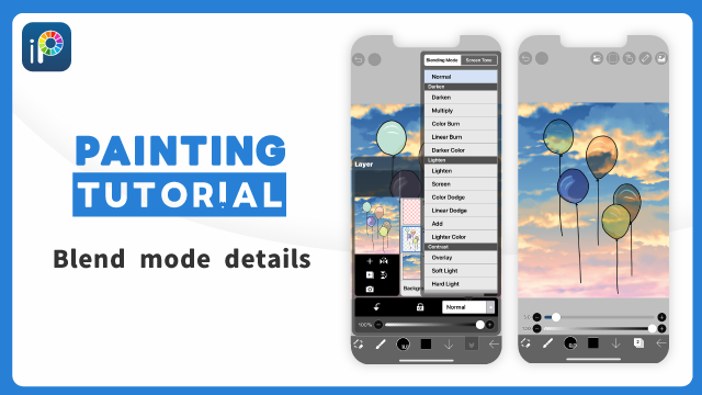
ibisPaint offers a wide variety of Blending Modes (Combination Mode, Drawing Mode). This allows you to specify how the layers are combined (blended).
Drawing on separate layers is a unique feature and advantage of digital illustration.
By separating line art and coloring onto different layers, or hair and face onto different layers, you can modify overlapping parts without having to redraw them because you can make changes on each layer independently.
or more details on the Layer Window, please refer toLayer Window Details.
Not only can you draw on separate layers, but you can also combine them by specifying the Blending Mode for each layer.
Blending Modes allow you to choose how the colors of the upper and lower layers are combined. This opens up a wide range of expressive possibilities that would be impossible with a single layer.
Digital colors are managed and displayed numerically. For example, red color, when displayed in RGB, the "three primary colors of light," has the values R=255, G=0, and B=0.
In Blending Mode, the color values of overlapping layers are calculated differently, and the results of calculation are displayed.
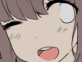
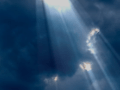
Blending Modes are perfect for expressing light and shadow. Light filtering through trees, the seabed seen through the ocean, the iris in the eye, the shadow of the eyelid and eyelashes falling on the eyeball, the shadow of the hair ends falling on the forehead—the world is full of light and shadow.
By learning Blending Mode techniques, you can master the subtle nuances of expressing light and shadow.
Blending Modes are a handy tool, but they do take some practice to fully grasp and utilize effectively. Simply reading about them might not be enough to truly understand how they work. The key is to experiment and try them out yourself in your own artwork.
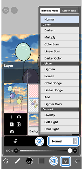
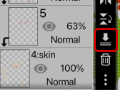
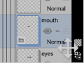
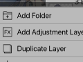
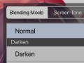
To change the Blending Mode, open the Layer Window by pressing the ①[ Layer Button ] and tap on ②[ Blending Mode list ] to choose a Blending Mode. The Blending Mode determines how the upper layer is combined with the lower layer.
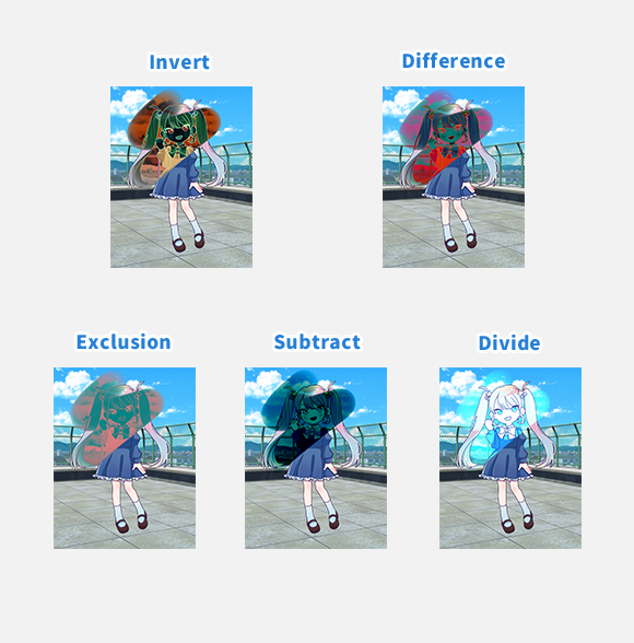
- About Blending Mode Explanations
- Normal
- Normal - Frequently used Blending Mode
- Dark
- Darken
- Multiply - Frequently used Blending Mode
- Color Burn
- Linear Burn
- Darker Color
- Light
- Lighten
- Screen - Frequently used Blending Mode
- Color Dodge
- Linear Dodge
- Add
- Lighter Color
- Contrast
- Overlay - Frequently used Blending Mode
- Soft Light
- Hard Light
- Vivid Light
- Linear Light
- Pin Light
- Hard Mix
- Variations
- Color
- Usage Examples
About Blending Mode Explanations
In the following sections, we will explain each Blending Mode in detail.
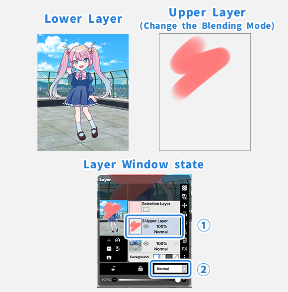
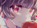
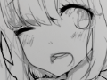
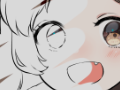
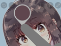
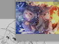
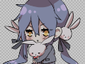
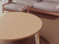
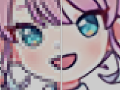
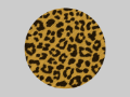
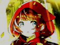
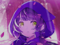
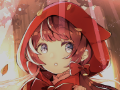
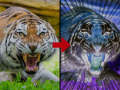
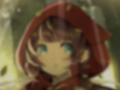
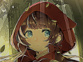
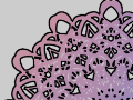
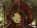
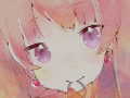
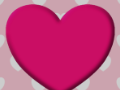
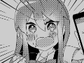
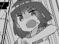
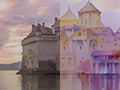
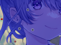
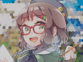
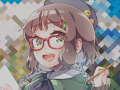
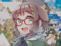
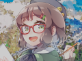
On the image above, the left picture is the lower layer, and the right picture is the upper layer. We will change the Blending Mode of the upper layer.
Select the ①[ Upper Layer ] on the Layer Window and change the Blending Mode from ②[ Blending Mode list ].
We will explain what happens when these two layers are combined (blended) using various Blending Modes.
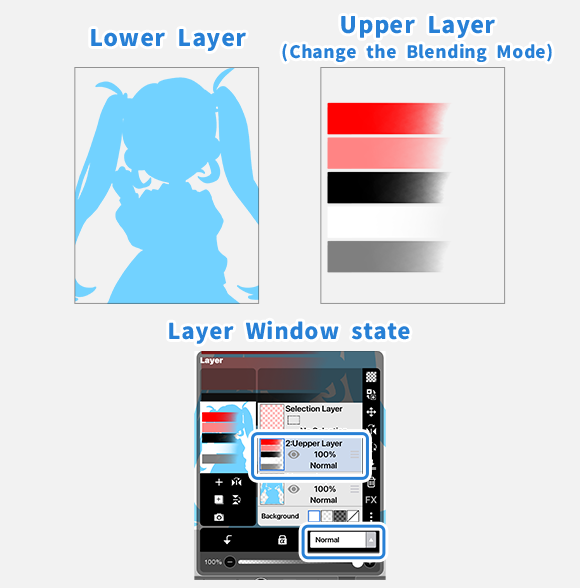
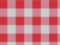
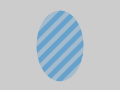
To compare the subtle differences in the properties of each Blending Mode,we have also included an image where a light blue (R=114, G=210, B=255) silhouette is set as the [ Lower Layer ], and gradient bars of red (R=255, G=0, B=0), pink (R=255, G=132, B=132), black (R=0, G=0, B=0), white (R=255, G=255, B=255), and gray (R=127, G=127, B=127) colors are overlaid as the [ Upper Layer ].
We will change the Blending Mode of the [ Upper Layer ] in the same way.
Normal
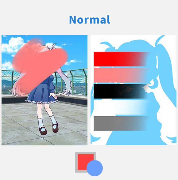
[ Normal ] … The upper layer is simply overlaid on top of the lower layer.
This is the default setting and results in the most natural composition.
To be precise, semi-transparent areas will appear as if cellophane has been placed over them. Completely transparent areas will take on the color of the lower layer, while completely opaque areas will retain the color of the upper layer.。
Dark
Here we will explain the Blending Modes that darken the image when layers are combined.
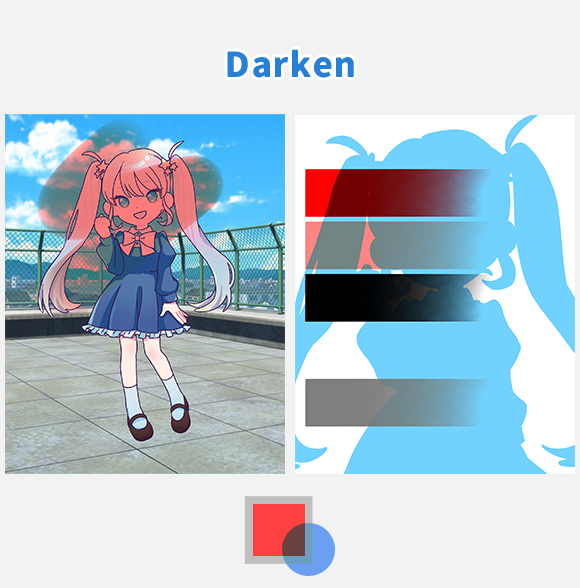
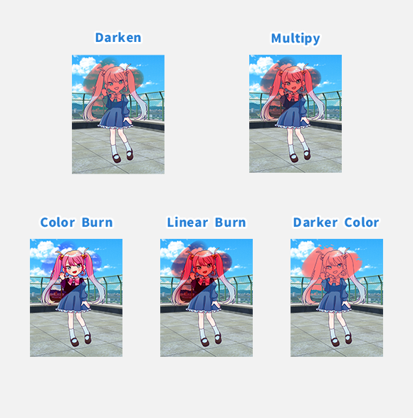
[ Darken ] … This mode compares the brightness of the lower and upper layers and results in the darker of the two colors.
It is effective when you want to darken only the bright parts of a photo or image while leaving the dark parts unchanged.
It compares the values of each of the RGB colors and displays the color with the lower (darker) value for each. Therefore, combining light blue (R=114, G=210, B=255) and red (R=255, G=0, B=0) results in brown (R=114, G=0, B=0).
If either the upper or lower layer is white (R=255, G=255, B=255), there will be no change.
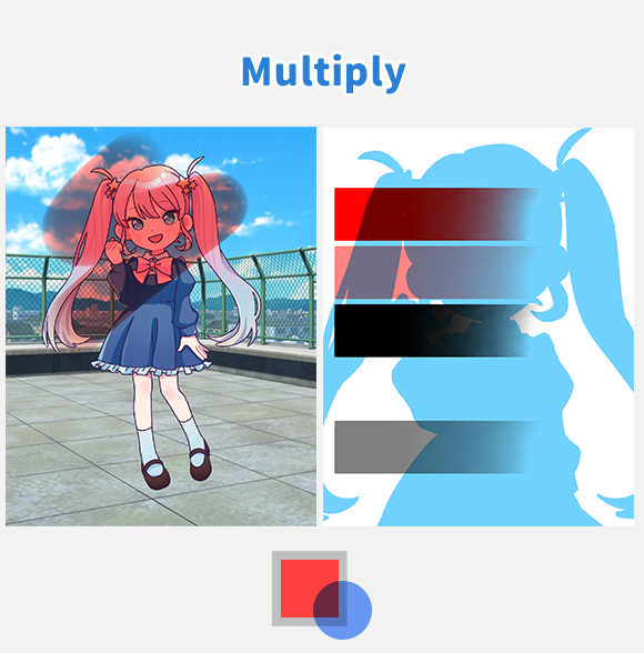
[ Multiply ] … Colors become darker. This mode multiplies the color of the lower layer with the color of the upper layer.
It is effective when painting areas that should be darker, such as shadows on skin or hair. It is also often used to color a lower layer while setting the line art layer to [ Multiply ].
This Blending Mode literally multiplies the RGB values of the lower and upper layers for each color. Since the resulting RGB values are smaller than the original values, the colors become darker.
If either the upper or lower layer is white (R=255, G=255, B=255), there will be no change.
In ibisPaint, color brightness is represented by values ranging from 0.0 to 1.0. If you color the upper layer with a brightness of 0.5, it will be blended with the lower layer, resulting in a brightness that is half of the lower layer's brightness (in other words, multiplied by 0.5, which is why this is called "Multiply"). If you color the upper layer with a brightness of 0.33, it will be blended with the lower layer, resulting in a brightness that is one-third of the lower layer's brightness. In this way, you can adjust the overall brightness to half or one-third, making it suitable for darkening while maintaining the ratio of light and dark of the originally colored lower layer.
To extract only the R channel of RGB, place a layer filled with red (R=255, G=0, B=0) above the target layer and set it to [Multiply]. This will set the values of G and B to 0, making a layer that retains only the R values of the original lower layer.
This way, you can separate each of the R, G, and B channels.
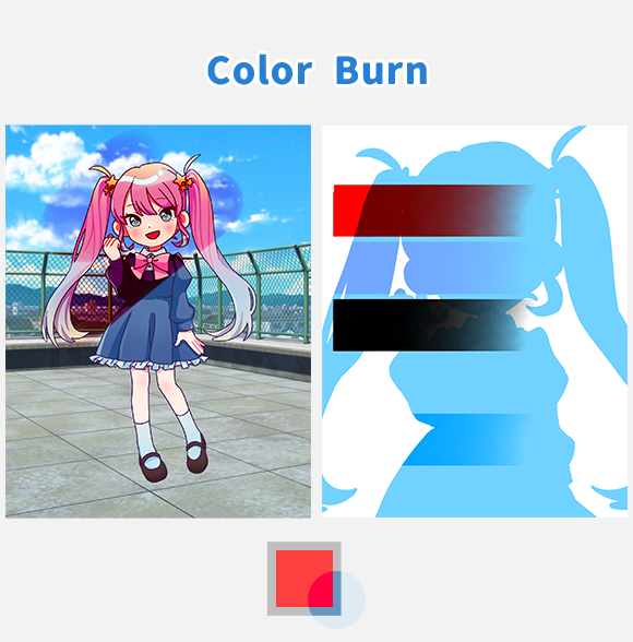
[ Color Burn ] … Darkens the image while increasing contrast.
It is effective when you want to darken an image but don't want the details in the dark areas to become obscured.
To darken a photo or illustration while strengthening its impression, duplicate the photo or illustration, change the blending mode to [ Color Burn ], and overlay it on top. This will increase the contrast and darken the image while making it more vivid.
If you want to darken only a specific color while increasing contrast, color with the complementary (opposite) color of the color you want to darken.
f either the upper or lower layer is white (R=255, G=255, B=255), there will be no change.
The term “Color Burn” originates from a technique using silver halide in analog photography to darken prints.
Using this mode for textures like paper, wallpaper, or noise can increase the amount of visual information on the screen and the overall impression of an artwork.
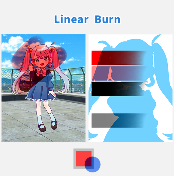
[ Linear Burn ] … Unlike [ Color Burn ], this mode darkens the entire image evenly, both dark and light areas.
Details in the dark areas may become difficult to see as they turn black. It is effective when you want to darken the entire image while increasing contrast.
f either the upper or lower layer is white (R=255, G=255, B=255), there will be no change.
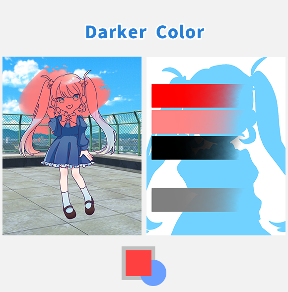
[ Darker Color ] … This mode compares the brightness of the colors on the lower and upper layers and displays the darker color as is.
It is effective when you want to change only the white parts of a black and white image.
It compares the total RGB values of the lower and upper layers and displays the color with the lower (darker) value as is. For example, when combining light blue (R=114, G=210, B=255) and red (R=255, G=0, B=0), the total value of light blue is 579 and the total value of red is 255. Since the value of red is smaller, red is displayed as is.
If either the upper or lower layer is white (R=255, G=255, B=255), there will be no change.
Light
Here we will explain the Blending Modes that brighten the image when layers are combined.
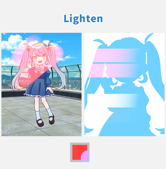
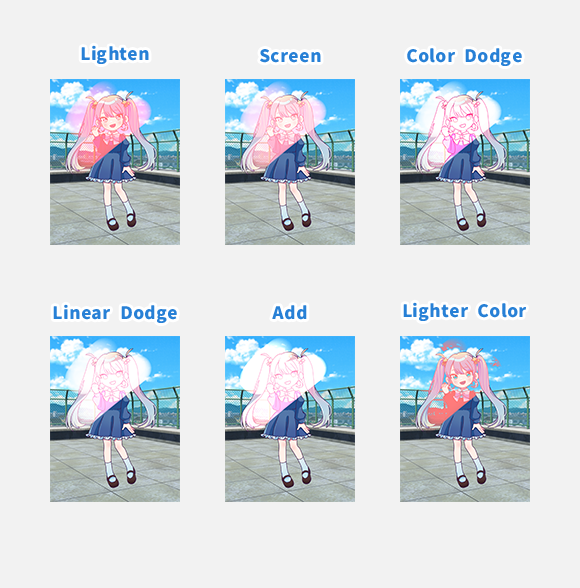
[ Lighten ] … [ Color Burn ]This mode compares the brightness of the lower and upper layers and results in the lighter of the two colors.
It is effective when you want to brighten only the dark parts of a photo or image while leaving the bright parts unchanged.
It compares the values of each of the RGB colors and displays the color with the higher (lighter) value for each. Therefore, combining light blue (R=114, G=210, B=255) and red (R=255, G=0, B=0) results in pink (R=255, G=210, B=255).
If either the upper or lower layer is black (R=0, G=0, B=0), there will be no change.
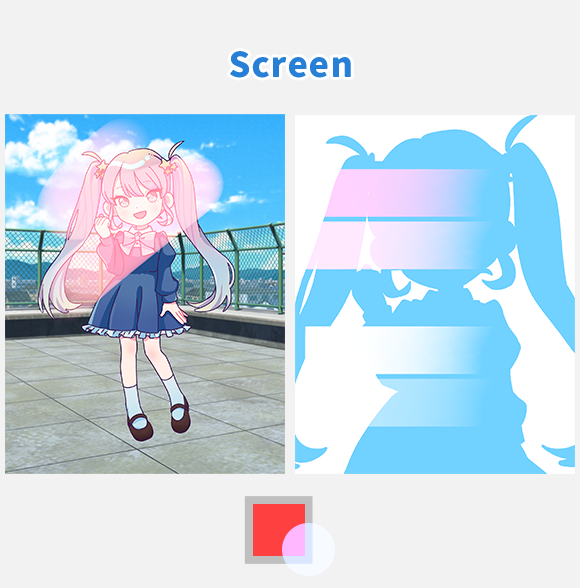
[ Screen ] … This mode brightens the image while maintaining the original ratio of light and dark. It is like the opposite of [Multiply].
It is effective for adding translucent brightness, such as light or steam.
To brighten a specific color while maintaining the original ratio of light and dark, simply color it with the desired color.
If either the upper or lower layer is black (R=0, G=0, B=0), there will be no change.

[ Color Dodge ] … Brightens the bright areas of the image.
It is effective when you want to brighten the image while increasing contrast.
Brightening the entire image can cause bright areas to whiteout (become pure white), so this mode is a way to brighten the image while increasing contrast without having the bright areas whitened out.
To brighten a photo or illustration while strengthening its impression, duplicate the photo or illustration, change the blending mode to [ Color Dodge ], and overlay it on top.
This will increase the contrast and brighten the image while making it more vivid. If you want to brighten only a specific color while increasing contrast, simply color it with the desired colo
If the upper layer is black (R=0, G=0, B=0), there will be no change.
The term "Color Dodge" originates from a technique using silver halide in analog photography to brighten only the dark parts of a print.
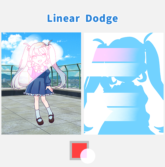
[ Linear Dodge ] … Unlike [ Color Dodge ], this mode brightens the entire image evenly, both dark and light areas.
Details in the bright areas may become difficult to see as they turn white. To brighten only a specific color overall, simply paint with the desired color. It is effective when you want to brighten the entire image while increasing contrast.
If either the upper or lower layer is black (R=0, G=0, B=0), there will be no change.
In the [ Multiply ] section, we explained how to separate RGB channels. If you combine the separated RGB channels using [Linear Dodge], they will return to their original state. They will also return to their original state if combined using [ Add ], which will be explained next.
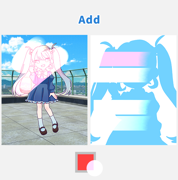
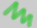
[ Add ] … This mode results in the brightest colors.
It is effective for expressing highlights or light sources
When the opacity is 100%, there is no difference between [ Linear Dodge ] and [ Add ]. However, in areas where the opacity is lowered, [ Add ] becomes much brighter. Therefore, it is effective for drawing glowing parts. It produces the brightest and most intense colors.
Since each RGB value is added (addition), if you want to brighten specific colors strongly, simply paint with the desired color. For example, combining light blue (R=114, G=210, B=255) and red (R=255, G=0, B=0) results in pink (R=255, G=210, B=255).
If either the upper or lower layer is black (R=0, G=0, B=0), there will be no change.
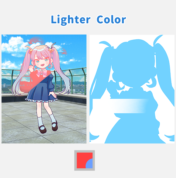
[ Lighter Color ] … This mode compares the brightness of the colors on the lower and upper layers and displays the lighter color as is.
It is effective when you want to change only the black parts of a black and white illustration.
It compares the total RGB values of the lower and upper layers and displays the color with the higher (lighter) value as is. For example, when combining light blue (R=114, G=210, B=255) and red (R=255, G=0, B=0), the total value of light blue is 579, and the total value of red is 255. Since the value of light blue is higher, light blue is displayed as is.
If either the upper or lower layer is black (R=0, G=0, B=0), there will be no change.
Contrast
Here we will explain the Blending Modes that change the contrast when layers are combined.
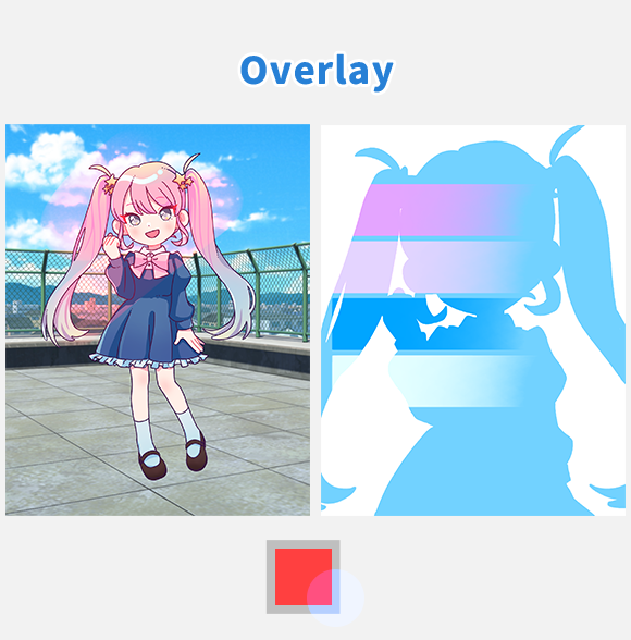
[ Overlay ] … Darkens dark areas and brightens light areas.
Use this mode when you want the effects of both [ Multiply ] and [ Screen ] at the same time.
It acts like [ Multiply ] in dark areas and like [ Screen ] in bright areas of the lower layer, making it effective for adding overall color while increasing saturation and contrast.
The pure black (R=0, G=0, B=0) and pure white (R=255, G=255, B=255) areas of the lower layer will not change, regardless of the color overlaid on top. This is because they cannot be made any darker or brighter.
Also, if the upper layer is gray (R=127, G=127, B=127), there will be no change.
Overlaying the same image with [ Overlay ] will result in increased vibrancy. Since the brightness and darkness of the lower layer are preserved, overlaying a color gradient on a black and white layer allows you to change the hue while maintaining the original light and dark values.
Even if the lower layer is colored, overlaying another layer can alter the hue. This allows you, for example, to transform a daytime scene into a sunset atmosphere.
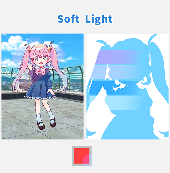
[ Soft Light ] … This mode slightly darkens dark areas and slightly brightens light areas. It has a similar effect to [ Overlay ] but with a softer touch.
Use this mode when the [ Overlay ] effect is too strong. Since it slightly darkens dark areas and slightly brightens light areas, it's effective when you want to subtly increase saturation and contrast.
The effect is softer than [ Overlay ], so the content of the upper layer blends into the lower layer.
Also, if the upper layer is gray (R=127, G=127, B=127), there will be no change.

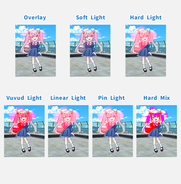
[ Hard Light ] … This mode makes dark areas very dark and light areas very light, while also increasing saturation. It has a similar effect to [ Overlay ] but with a more intense result.
Use this mode wheUnlike [ Overlay ] and [Soft Light], this mode creates an effect as if the color of the upper layer is directly shining onto the lower layer. Even pure black and pure white areas of the lower layer will change depending on the color overlaid on top.
Also, if the upper layer is gray (R=127, G=127, B=127), there will be no change.
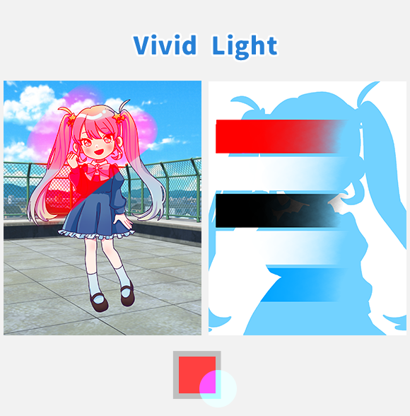
[ Vivid Light ] … This mode makes dark areas darker, light areas lighter, and further increases contrast. Use this mode when you want the effects of both [ Color Burn ] and [ Color Dodge ] at the same time.
It is effective for significantly increasing saturation and contrast to create a strong impression.
It acts like [ Color Burn ] in dark areas and like [ Color Dodge ] in bright areas of the upper layer, resulting in stronger contrast than [ Overlay ].
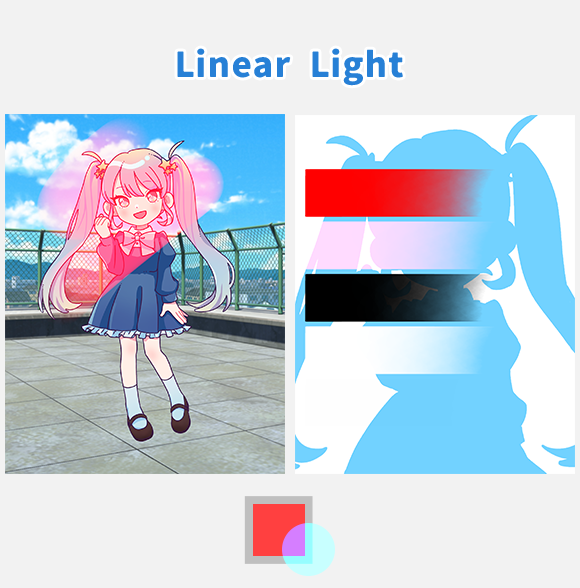
[ Linear Light ] … This mode makes dark areas even darker, light areas even lighter, and further increases contrast. Use this mode when you want the effects of both [ Linear Burn ] and [ Linear Dodge ] at the same time.
It is effective for significantly increasing saturation and contrast while also enhancing the distinction between light and dark areas to create a strong impression.
It acts like [ Linear Burn ] in dark areas and like [ Linear Dodge ] in bright areas of the upper layer, resulting in stronger light and dark values than [Vivid Light] creates.
Also, if the upper layer is gray (R=127, G=127, B=127), there will be no change.
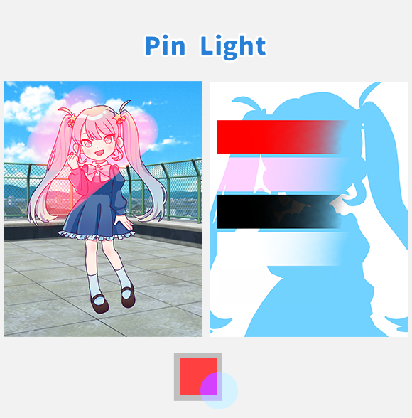
[ Pin Light ] … If the color of the upper layer is bright, it compares the brightness of the lower and upper layers and results in the lighter of the two colors. If the color of the upper layer is dark, it compares the brightness of the lower and upper layers and results in the darker of the two colors.
It is effective for changing the color tone in the finishing touches.
Use this mode when you want the effects of both [ Darken ] and [ Lighten ] at the same time.
It acts like [ Darken ] in dark areas and like [ Lighten ] in bright areas of the upper layer.
Also, if the upper layer is gray (R=127, G=127, B=127), there will be no change.
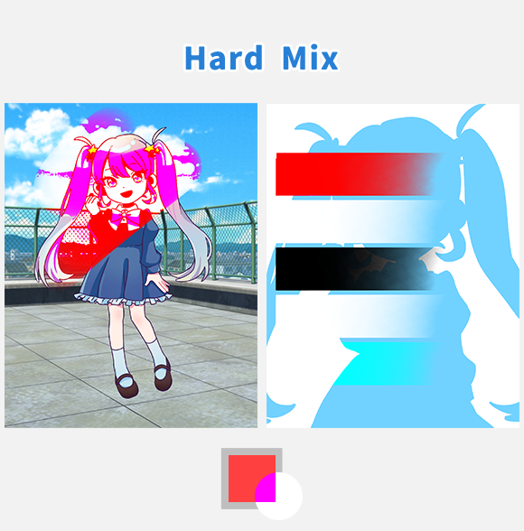
[ Hard Mix ] … This is the most extreme Blending Mode. Use it when you want an extreme, psychedelic effect.
It is effective for creating pop art with few colors and a strong impact.
This mode forces each RGB channel to either 0 or 255, so only eight colors will appear: black, red, green, yellow, blue, magenta, cyan, and white.
If the sum of the RGB values of the upper and lower layers is less than 255, it is set to 0; if it is 255 or more, it is set to 255. For example, combining light blue (R=114, G=210, B=255) and gray (R=127, G=127, B=127) results in cyan (R=0, G=255, B=255) because the sum of the RGB values is (R=241, G=337, B=382)
Variations
Here we will explain the Blending Modes that change the color and brightness when layers are combined.
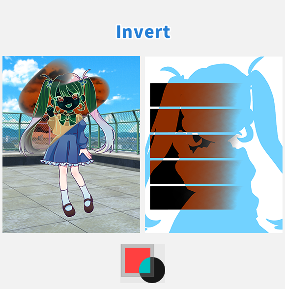
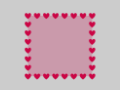
[ Invert ] … Inverts the color of the painted area. Creates a partial negative effect.
It is effective for drawing lines that you want to stand out, such as speed lines.
The color used on the upper layer does not affect the result, and only the colors where the upper and lower layers overlap are inverted.
This mode subtracts each RGB value of the lower layer color from 255. For example, when applied to light blue (R=114, G=210, B=255), the result is brown (R=141, G=45, B=0).
[ Invert ] results in an effect like a negative film. Negative film is a type of photographic film used in analog cameras, where the colors and brightness of light are captured in reverse.
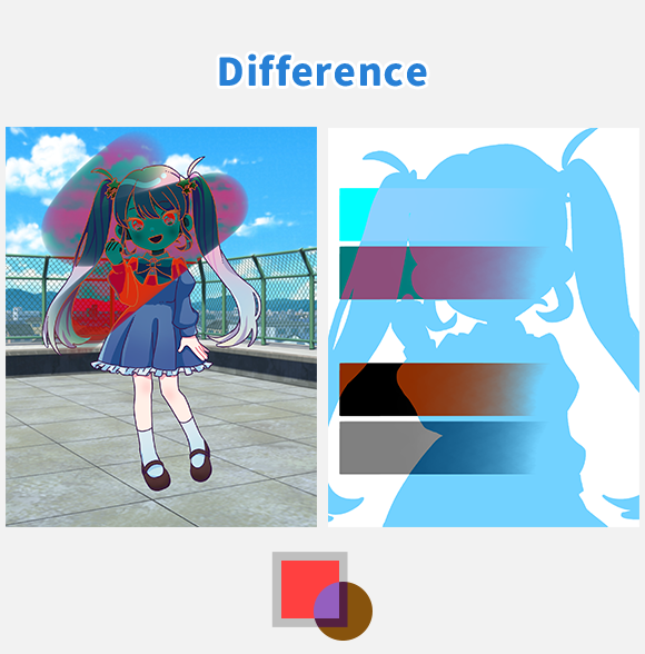
[ Difference ] … Areas where the lower and upper layers have the same color will become pure black, while areas with greater color differences will become brighter.
This is effective when you want to drastically change the impression of an image.
For each RGB channel, the smaller value is subtracted from the larger one. Since it's a subtraction, the colors will become darker. For example, combining light blue (R=114, G=210, B=255) and gray (R=127, G=127, B=127) results in dark blue (R=13, G=83, B=128).
If the color of the upper layer is black (R=0, G=0, B=0), there will be no change. If it is white (R=255, G=255, B=255), it will be similar to the [ Invert ] Blending Mode.
If the upper layer is red (R=255, G=0, B=0) and the lower layer is white (R=255, G=255, B=255), only the R channel will be inverted, resulting in cyan (R=0, G=255, B=255).
It can also be used when comparing two images. This allows you to see where they differ.
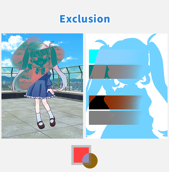
[ Exclusion ] … Areas where the lower and upper layers have the same color will become darker, while areas with greater color differences will become brighter. It is similar to [ Difference ], but the contrast is weaker when colors other than white or black overlap, resulting in a milder blend than [ Difference ].
It is effective when you want to create an image that looks like a negative-positive inversion while retaining the color tones.
Same as [ Difference ], the white parts of the upper layer are inverted, while the black parts remain unchanged.
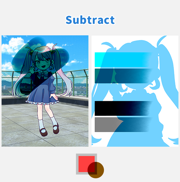
[ Subtract ] … The image is darkened by the amount of color of the upper layer.
This mode is effective when you want to create a strong, dark impression rather than a mild shadow.
For each RGB channel, the value of the upper layer is subtracted from the value of the lower layer. This is literally the subtraction Blending Mode. Since it involves subtraction, the colors become darker. For example, if the lower layer is light blue (R=114, G=210, B=255) and the upper layer is gray (R=127, G=127, B=127), the result will be dark blue (R=0, G=83, B=128).
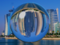
(Negative values are set to 0, and values exceeding 255 are set to 255.)
This is the strongest Blending Mode in terms of darkening strength.
If the upper layer is black (R=0, G=0, B=0), there will be no change.
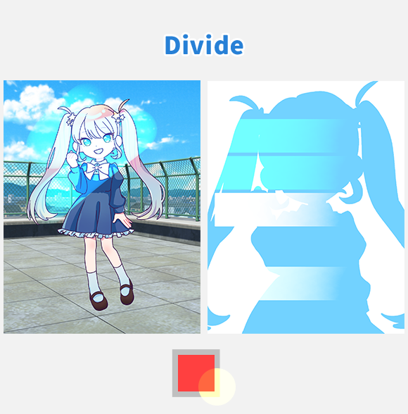
[ Divide ] … Allows you to adjust both hue and brightness.
This is effective when you want to balance colors and achieve a natural finish.
This Blending Mode literally divides the lower layer by the upper layer for each RGB value.
For each RGB channel, the value of the lower layer is divided by the value of the upper layer. Since it involves division, the colors become brighter. For example, if the lower layer is light blue (R=114, G=210, B=255) and the upper layer is red (R=255, G=0, B=0), the result will be a color close to cyan (R=114, G=255, B=255).
(Negative values are set to 0, and values exceeding 255 are set to 255.)
If the upper layer is black (R=0, G=0, B=0), there will be no change.
When the same colors are used together, the result becomes white (R=255, G=255, B=255).
If the upper layer is black (R=0, G=0, B=0), there will be no change.
By using [ Divide ], you can erase only the sketch when you have both a sketch and line art on the same layer.
You can also use it to make the paper white when importing a picture with the line art. Layer 3 (Division): Pick up the color of the paper with the Eyedropper to color the entire surface with that color. Layer 2 (Multiply): The lines drawn on the paper are imported as a photo. Layer 1 (Normal): This layer is used as the working layer and for coloring. In this state, if you color Layer 1, you can color it without erasing the lines.
Color
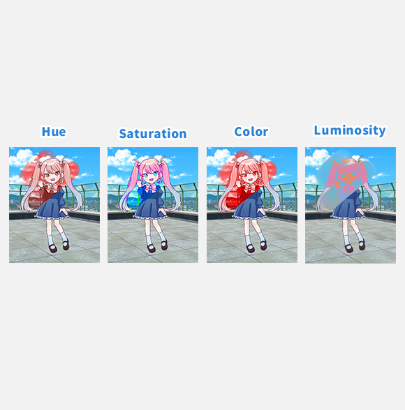
Here we will explain the Blending Modes that mainly change the Hue, Lightness, Saturation (HLS color space) of an image.
Lightness and brightness are different concepts.
Brightness is the value of the light of a color, while lightness refers to the degree of light perceived by the human eye.
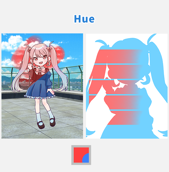
[ Hue ] … Only the hue changes to that of the upper layer.
This is effective when you want to change only the hue without changing the saturation or lightness.
Changes the hue of the lower layer according to the hue of the upper layer. In other words, it displays the hue of the upper layer, and the saturation and lightness of the lower layer.
When the upper layer has 100% opacity, only the hue of the upper layer is applied, but if you lower the opacity, the state of the lower layer is also taken into account.
If you want to make fine adjustments to the hue, you can gradually bring the color of the painted area closer to the target color by painting over the area you want to change the hue with the target color on the upper layer with lowered opacity.
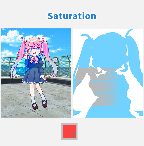
[ Saturation ] … Only the saturation changes to that of the upper layer.
This is effective when you want to change only the saturation without affecting the lightness or hue.
Changes the saturation of the lower layer according to the saturation of the upper layer. In other words, it displays the hue of the lower layer, the saturation of the upper layer, and the lightness of the lower layer.
You can turn a picture into black and white by creating a layer filled with pure white (or pure black) and setting its Blending Mode to [ Saturation ]. Since pure white (or pure black) has zero saturation (vividness of color), the image will be converted to black and white, which is a state of zero saturation.
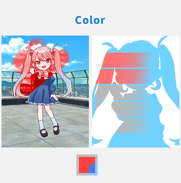
[ Color ] … he hue and saturation change to those of the upper layer.
This is effective when you want to change only the hue and saturation without affecting the lightness.
Changes the hue and saturation of the lower layer according to the hue and saturation of the upper layer. In other words, it displays the hue and saturation of the upper layer and the lightness of the lower layer.
The technique mentioned in the [ Saturation ] section for turning an image black and white can also be achieved using [ Color ].
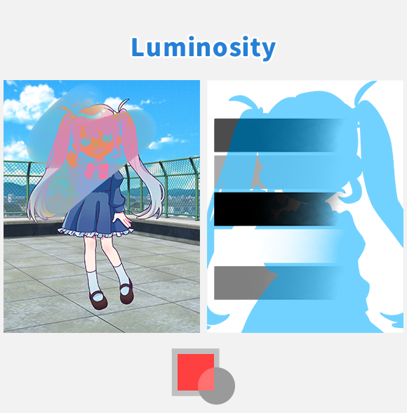
[ Luminosity ] … The lightness changes to that of the upper layer.
This is effective when you want to adjust the lightness of a color.
In this Blending Mode, luminosity refers to the lightness of a color when converted to grayscale.
This mode changes the lightness of the lower layer according to the lightness of the upper layer. In other words, it displays the hue and saturation of the lower layer and the lightness of the upper layer.
This concludes the explanation of Blending Modes.
Expand the range of expression in your illustrations by using Blending Modes!
Usage Examples
There are many Blending Modes, but the most commonly used ones are [Normal], [Multiply], [Add], [Overlay], and [Screen]. For other Blending Modes, it is recommended to experiment and use the ones that you like the best.。
Below, we will introduce some examples of how to use the most common Blending Modes.
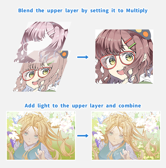
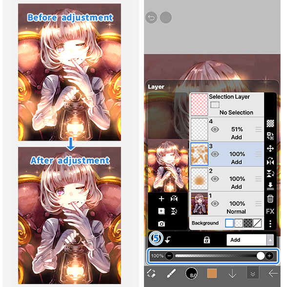
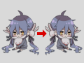
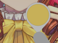
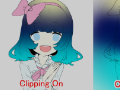
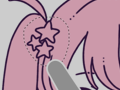
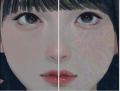
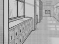
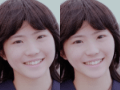
Example of How to Use the Multiply Blending Mode
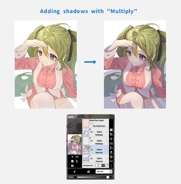
[ Multiply ] is often used for adding shadows. The left image shows the state before adding shadows with [Multiply], and the right image shows the state after.
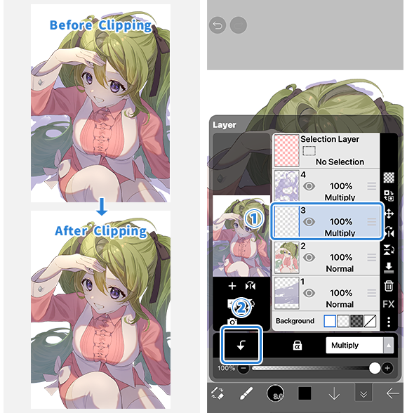
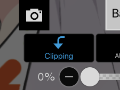
If you want to apply a blending mode to a specific layer only, use clipping. Select the ①[ layer you want to use for blending ] and tap on ②[ Clipping ].
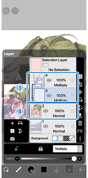
Now the ③[ Upper Layer ] will be clipped to the ④[ Lower Layer ] and will not extend beyond the content drawn on the ④[ Lower Layer ].
Tips on how to add shadows are also explained on the official ibisPaint YouTube channel.
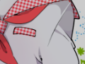
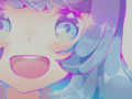
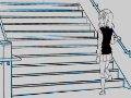
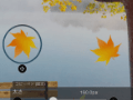
Example of How to Use the Add Blending Mode
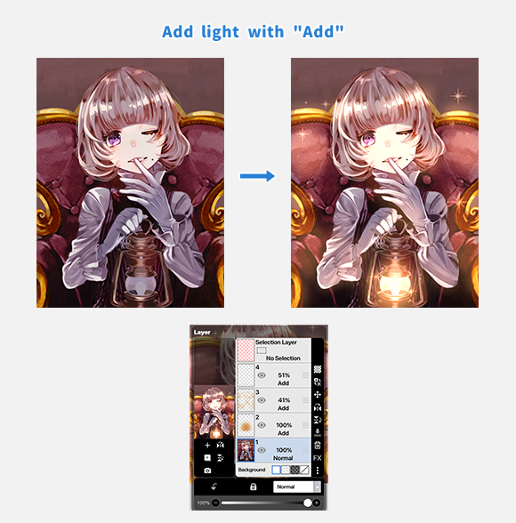
[ Add ] is often used for adding light sources and highlights. The left image shows the state before adding light with [ Add ], and the right image shows the state after.
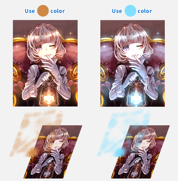
Since the color used on the layer brightens the image, it's a good idea to use warm colors for warm light and cool colors for cool light.
[ Add ] can produce strong light by default, so adjust the opacity while checking the finished image.
Not only for [ Add ], but for all layers, you can adjust the opacity to control the strength of the effect.
If you feel the effect is too strong, try adjusting the opacity.
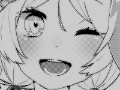
Example of How to Use the Overlay Blending Mode
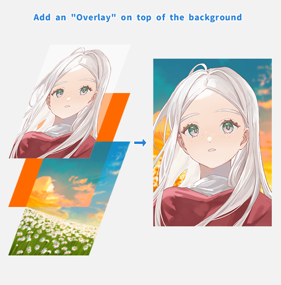
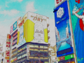
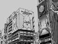
[ Overlay ] can be used to change the color tone of an image. It's often used to transform the color of the sky from day to night or to change a person's hair color from brown to blue.
On the image above, a layer filled with orange is added between the background and the character, and the blending mode is set to [ Overlay ]. Only the background under the [ Overlay ] layer has changed to a sunset-like tone.
You can modify your artwork by applying the Blending Mode effects partially, such as only to the background or only to a character.
Chapter
-
 01.Introduction
 -
 02.Start Creating an Artwork
 -
 03.Toolbar and Tool Selection
 -
 04.Do Your Draft Sketch by Hand
 -
 05.About Layers
 -
 06.Let's Trace
 -
 07.Undo and Eraser
 -
 08.Fine Tuning Using the Lasso tool
 -
 09.Check by Reflecting Horizontally
 -
 10.Select Colors in the Color window
 -
 11.Use Color Fill for the Undercoat
 -
 12.Turn Clipping On
 -
 13.Making a Gradation (Shading)
 -
 14.Select a color from the canvas or layer
 -
 15.Set the Time before Quick Eyedropper Starts
 -
 16.Create Highlights and Shadows
 -
 17.Paste a Texture
 -
 18.Let's Merge Layers
 -
 19.Sign Your Artwork
 -
 20.View Your Artwork
 -
 21.Post Your Artwork
 -
 22.Share Your Artwork
 -
 23.Open your ibisPaint data in Clip Studio Paint
 -
 24.Premium Membership / Ad Removal Upgrade (for iPhone/iPad, Android)
 -
 25.Premium Membership / Pro Upgrade (for Windows, Mac)
 -
 26.Synchronizing the artworks on your device with Cloud Storage
 -
 27.Save the past state of an Artwork as an IPV file
 -
 28.Rearrange artworks
 -
 29.Artworks Folder Feature
 -
 30.Make custom brush
 -
 31.Create Original Brush Patterns
 -
 32.Installing and Exporting the Custom Brush
 -
 33.Release a Custom Brush to the Online Gallery
 -
 34.Brush Export and Import
 -
 35.Search For Brushes
 -
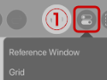
 36.Display images to use as reference
 -
 37.Add Color to the Analog Image using Multiply
 -
 38.Stabilizer
 -
 39.Layer: Clipping is convenient
 -
 40.Layer: Changing the color with Alpha Lock
 -
 41.Layer: Let's try using Screen Tone
 -
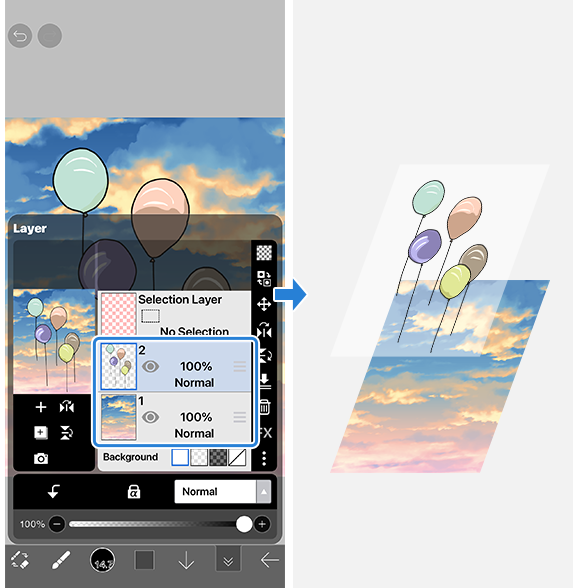
 42.Layer: Selection Layer
 -
 43.Layer: Save Layer as Transparent PNG command
 -
 44.Layer: Naming your layers to manage them
 -
 45.Layer: Rasterize
 -
 46.Layer: Layer Folders
 -
 47.Layer: Folder Move/Transform
 -
 48.Layer: Add Layer from Canvas
 -
 49.Vector Layer
 -
 50.How to edit a brush shape
 -
 51.Contents Layer Selection
 -
 52.Apply Canvas Papers to your canvas
 -
 53.Display Grid on the Canvas
 -
 54.Export an Artwork (Save)
 -
 55.Export in CMYK (Save)
 -
 56.Save canvas as Transparent PNG
 -
 57.Make the background transparent with Eraser Bucket
 -
 58.Bucket Tool: Surrounding Fill / Surrounding Eraser
 -
 59.Putting texture to the floor with Perspective Form
 -
 60.Skirt with Mesh Form
 -
 61.Entering text with Text tool
 -
 62.Creating manga with Frame Divider tool
 -
 63.Enlarging the canvas with Canvas Size
 -
 64.Cutting off the canvas with Trim
 -
 65.Create a Manga Manuscript for Printing
 -
 66.Canvas creation with resolution (dpi) specification
 -
 67.Changing image resolution with Resize
 -
 68.Change canvas Color Mode
 -
 69.Output High-Resolution Images with AI (Artificial Intelligence)
 -
 70.AI Disturbance
 -
 71.Texture with Material tool
 -
 72.Cut, Copy, Paste
 -
 73.Ruler: Straight Ruler
 -
 74.Ruler: Circular Ruler
 -
 75.Ruler: Elliptical Ruler
 -
 76.Ruler: Radial Ruler
 -
 77.Ruler: Mirror Ruler
 -
 78.Ruler: Kaleidoscope Ruler
 -
 79.Ruler: Array Ruler
 -
 80.Ruler: Perspective Array Ruler
 -
 81.Drawing Tool: Straight Line
 -
 82.Drawing Tool: Rectangle
 -
 83.Drawing Tool:Circle
 -
 84.Drawing Tool:Ellipse
 -
 85.Drawing Tool:Regular Polygon
 -
 86.Drawing Tool:Bezier Curve
 -
 87.Drawing Tool:Polyline
 -
 88.Drawing Tool:Fill
 -
 89.Selection Area tool: Color Range
 -
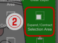 90.Selection Area tool: Expand/Contract Selection Area
 -
 91.Special: Liquify Pen
 -
 92.Special: Lasso Fill
 -
 93.Special: Lasso Eraser
 -
 94.Special: Copy Pen
 -
 95.Filter (Adjust Color): Brightness & Contrast
 -
 96.Filter (Adjust Color): Tone Curve
 -
 97.Filter (Adjust Color): Hue Saturation Lightness
 -
 98.Filter (Adjust Color): Color Balance
 -
 99.Filter (Adjust Color): Extract Line Drawing
 -
 100.Filter (Adjust Color): Find Edges (Handwriting)
 -
 101.Filter (Adjust Color): Find Edges
 -
 102.Filter (Adjust Color): Change Drawing Color
 -
 103.Filter (Adjust Color): Mono Color
 -
 104.Filter (Adjust Color): Grayscale
 -
 105.Filter (Adjust Color): Black & White
 -
 106.Filter (Adjust Color): Posterize
 -
 107.Filter (Adjust Color): Invert Color
 -
 108.Filter (Adjust Color): Gradation Map
 -
 109.Filter (Adjust Color): Levels Adjustment
 -
 110.Filter (Adjust Color): Replace Color
 -
 111.Filter (Blur): Gaussian Blur
 -
 112.Filter (Blur): Zooming Blur
 -
 113.Filter (Blur): Moving Blur
 -
 114.Filter (Blur):Spin Blur
 -
 115.Filter (Blur): Lens Blur
 -
 116.Filter (Blur): Mosaic
 -
 117.Filter (Blur): Unsharp Mask
 -
 118.Filter (Blur): Frosted Glass
 -
 119.Filter (Style): Stroke (Both)
 -
 120.Filter (Style): Stained Glass
 -
 121.Filter (Style): Wet Edge
 -
 122.Filter (Style): Glow (Inner)
 -
 123.Filter (Style): Bevel (Inner)
 -
 124.Filter (Style): Bevel (Outer)
 -
 125.Filter (Style): Emboss
 -
 126.Filter (Style): Relief
 -
 127.Filter (Style): Waterdrop (Rounded)
 -
 128.Filter (Style): Stroke (Outer)
 -
 129.Filter (Style): Glow (Outer)
 -
 130.Filter (Style): Satin
 -
 131.Filter (Style): Drop Shadow
 -
 132.Filter (Style): Extrude
 -
 133.Filter (Style): God Rays
 -
 134.Filter (Draw): Parallel Gradation
 -
 135.Filter (Draw): Concentric Gradation
 -
 136.Filter (Draw): Radial Line Gradation
 -
 137.Filter (Draw): Radial Line
 -
 138.Filter (Draw): Speed Line
 -
 139.Filter (Draw): Clouds
 -
 140.Filter (Draw): QR Code
 -
 141.Filter (AI): Watercolor Filter
 -
 142.Filter (AI): Background Removal
 -
 143.Filter (Artistic): Anime Background
 -
 144.Filter (Artistic): Manga Background
 -
 145.Filter (Artistic): Chromatic Aberration (Color Shift, RGB Shift)
 -
 146.Filter (Artistic): Glitch
 -
 147.Filter (Artistic): Noise
 -
 148.Filter (Artistic): Retro Game
 -
 149.Filter (Artistic): Chrome
 -
 150.Filter (Artistic): Bloom
 -
 151.Filter (Artistic): Cross Filter
 -
 152.Filter (Artistic): Sheer
 -
 153.Filter (Pixelate): Pixelate Crystalize
 -
 154.Filter (Pixelate): Hexagonal Pixelate
 -
 155.Filter (Pixelate): Square Pixelate
 -
 156.Filter (Pixelate): Triangular Pixelate
 -
 157.Filter (Pixelate): Pointillize
 -
 158.Filter (Pixelate): Dots (Hexagonal)
 -
 159.Filter (Pixelate): Dots (Square)
 -
 160.Filter (Transform): Expansion
 -
 161.Filter (Transform): Fisheye Lens
 -
 162.Filter (Transform): Sphere Lens
 -
 163.Filter (Transform): Wave
 -
 164.Filter (Transform): Ripple
 -
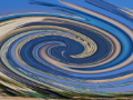 165.Filter (Transform): Twirl
 -
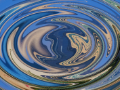
 166.Filter (Transform): Polar Coordinates
 -
 167.Filter (Frame): Table
 -
 168.Filter (Frame): Blur Frame
 -
 169.Filter (Movie): Rain
 -
 170.Adjustment Layer
 -
 171.Create an animation
 -
 172.Manga Function: Let's create a manga manuscript
 -
 173.Manga Function: Master the Manga creation tools
 -
 174.Manga Function: Make Use of Materials
 -
 175.Manga Function: Publishing and Printing your Manga
 -
 176.Changing Devices & File Transfers
 -
 177.Settings window details
 -
 178.Change the Background Color of the Canvas
 -
 179.Details of Brush Parameters
 -
 180.Bucket tool details
 -
 181.Layer Window Details
 -
 182.Transform tool details
 -
 183.Blend mode details
 -
 184.View Menu details
 -
 185.How to upload transparent PNG onto X
 -
 186.Importing and exporting Photoshop files (PSD)
 -
 187.Posting Multiple Pages of Comic to the Online Gallery
 -
 188.Gestures, Keyboard shortcuts (iOS,iPadOS,Android versions)
 -
 189.Gestures, Keyboard shortcuts (Windows Version)
 -
 190.Display a Crosshair Symbol When Hovering the Stylus Pen
 -
 191.Set Up Palm Rejection
 -
 192.Use a Promo Code
 -
 193.Delete Account
- Artwork Rankings
- Artist Rankings
- Official accounts


